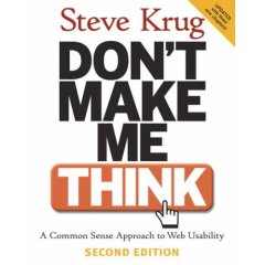
I recently purchased Steve Krug’s book Don’t Make Me Think: A Common Sense Approach to Web Usability for a plane trip to California to my brother’s wedding.

I was able to read the entire book for the most part in about 2-3 hours (which Steve notes was on purpose). Along the way I kept some notes on a piece of paper as well as some in my head. What I found after finishing was I was starting to look at the web sites I work on (FrightCatalog.com, YumDrop.com, and ImportCostumes.com) in a different way. Steve is very accurate in stating that developer’s look at their web sites very differently than those who will visit them. We think that if we like a design aspect or we find a feature useful, the entire world will. After all, we’re trying to develop for the average user, right? Wrong. There is no average user (and if there was, developers certainly aren’t in that group). We, as developers, aren’t the target audience. The rest of the world is and we need to make sure our sites are as easy to use as possible so people don’t have to (as Steve states time and time again) muddle through.
By the end of the book, Steve delves into Usability Testing, something we’ve only done briefly for YumDrop (and it did work when we did it), but we haven’t continued. We will now. To improve our conversions, we need to get people to look at more product. That means seeing how they use the site and what prevents them from purchasing products. One of the first changes we made was altering the header of the Fright Catalog index page, putting search in the upper left and calling more attention to the button. We found that only 18% of visitors used search, which is abysmal. My guess is they didn’t see it over on the right side of the page where it was before because people scan (they don’t read) web sites left to right (like a newspaper or book). I’ll report later on if that percentage increases.
If you don’t have a copy of it, I highly recommend you buy it. Steve does an excellent job at opening your eyes to a new world of developing web sites and retaining users. I’m really excited to apply more and more of what he talks about in his book to our sites. I’ll also be reading it multiple times, which is easy because the book is short. I’m sure I missed some good tidbits!
I read this book last friday, Bill, also in about 3 hours, on a plane.
I was on my way to an affiliate marketing conference where a dozen or so merchants presented their websites and affiliate programs. It was all I could do to not channel Steve Krug with comments on every presentation.
I did make one comment and plug the book, so hopefully some of the merchants and affiliates in the room will pick it up.
It was a great read. Thanks to you and Kyle for tipping me off to it.